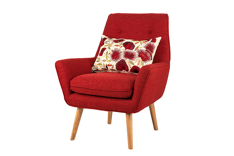
That’s right folks. It’s all rock n roll. Ferraris, Hilton hotels, champagne, screeching tyres and product photography.
It’s a rush.
So, product photography. It’s one of those enjoyable things where you can kick back and studiously approach the subject. There’s not much room for interpretation, you’re representing a product to look how it looks but also trying to show it off and make it look pretty darned decent – you need to have your lighting on point and even, your angles consistent (massively important), your WB up to scratch and your cutout chops freshly honed.
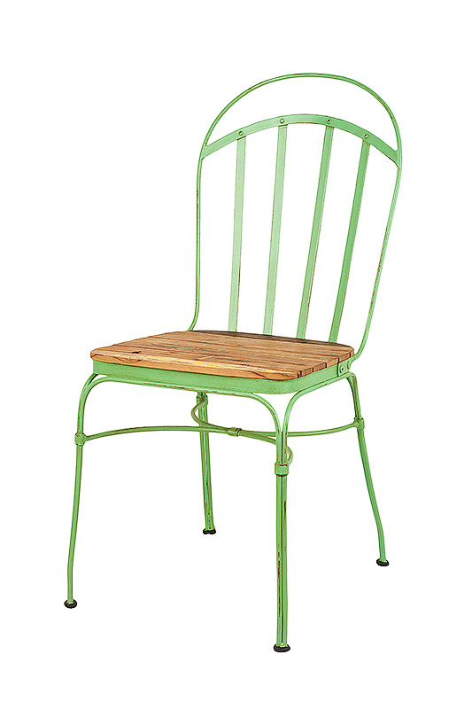
Vast Interiors contacted me to shoot a range of product for e-commerce and for advertising/marketing reasons- images they could cutout and put on banners, web ads, mailshots, the usual fun places where product photos get their views. Who are Vast and what about their product range? They say: “Our premium furniture ranges are unique and exclusive to Vast. Each piece has been meticulously created by expert craftsmen, designed to withstand generations of use. Our timber products highlight the natural beauty of the timber from which they were made and bring a sense of warmth and individuality to a home.” Warmth and individuality, people. And you thought a stool was just a stool…
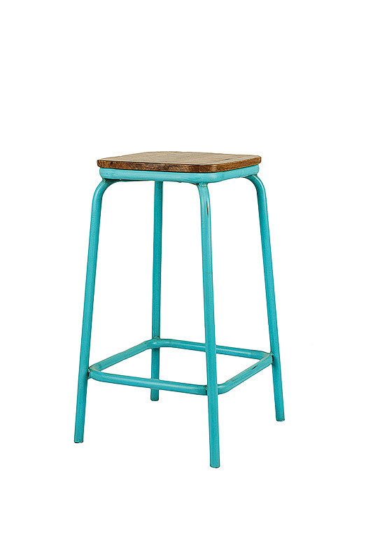
The lighting on all these shots was the same (gotta keep it consistent) and pretty big since I’m normally trying to minimise the amount of stuff I use. The final tweaked setup was 3 lights – one on either side, and one on a boom up above and pointing down. Everything was softened with softboxes to spread the light into a nice wrap-around softness. Most clients don’t like badass rim lighting and smoke effects in the background for some reason. The lights to left and right were at around 45 degrees providing even coverage across the front and sides of the object and they would move backwards or forwards depending on how big or small the piece being photographed was. For the most part I’m shooting at ISO 200, 1/200, and getting around f/16. Shooting with a 24/70mm or an 85mm depending on how much space I have behind me to walk back into.
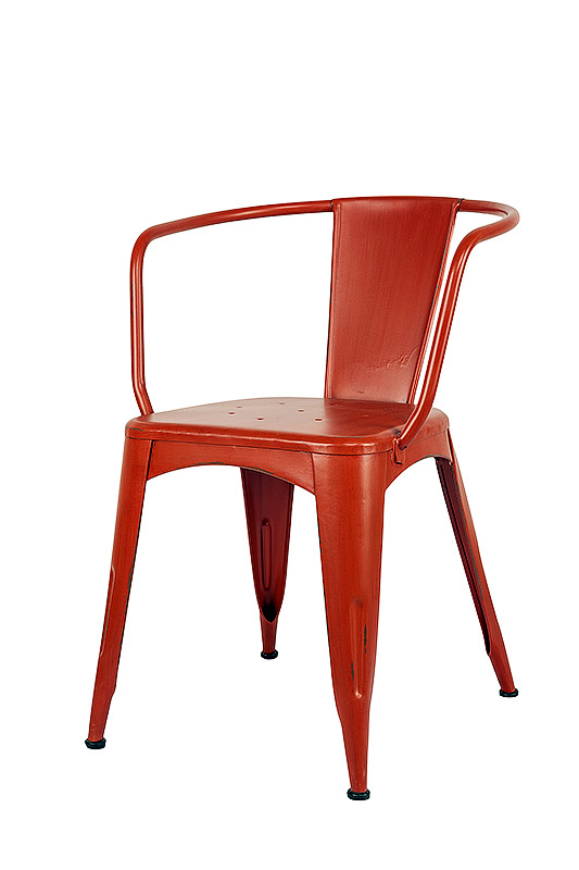
Once you’re setup with the lights it’s just rinse and repeat. Setup the product in the middle of the lights, click. Change product. Click. Change product. Click. We got through about 40 pieces in an hour which is basically light-speed considering the place where I used to shoot for the FMCG industry had a ‘1 product per 15 minute’ target. Smashed it.
A while back I covered some of the basics of white balancing and how it can be used for creative effect. Here it was about the opposite – the most representative colours that were true to the object and designer. Wood comes in a million different shades of brown so to get all those different shades precise I used my fabulous pocket-sized WB card checker thing and calibrated everything to it while batch editing in Lightroom. One click, ctrl+a, sync and bam, all the colours are calibrated to that little grey guy. And since every shot was under the same lighting conditions we know that the same settings will apply to all of the images. That WB card is one of the most useful things I own and it cost me less than a coffee, plus it’s credit card sized so it would even fit in your wallet if you’re that cool and can pull it off.
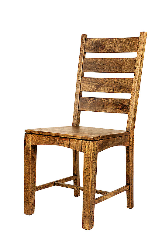
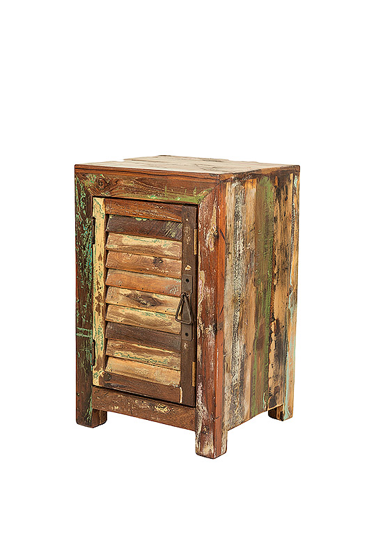
It’s hard to write something engaging about product photography because seriously, not a lot happens, but sometimes that’s just what you need. As aforementioned it’s studios, methodical and a scientific cause/effect approach to lighting and photography where you have to indulge your analytical brain and your lighting knowledge and just photograph things as they are, not as you think they are. Keep it simple, but keep it right.
