Styling by Louise Hall-Strutt, Wardrobe by Barkers.
This was the week before Joe’s fight with Daniel Martz. I had an exclusive shoot with Joe on behalf of a magazine running an 8 page article on him, his career, and his future. There was a 2 hour turnaround time for this, which included time for the interview at the end. On the drive down I had visions of a guy in a dusty ring in some industrial looking space, with bare light bulbs hanging from the ceiling and bruised punching bags swinging from girders. The reality was a little different. The shoot took place in an old garage converted into a gym where Joe has been training since he was a boy. Not grand by any means but honestly more suited to Parker and the space had that level of authenticity and life you just couldn’t plan for (or make in a studio). No ring, no fancy props, just a man training hard by himself in his garage in Papatoetoe struggling and fighting to realise his dreams.
I also had word this might end up on the cover and since I’m familiar with this magazine’s style and their usual choices for cover artwork it filled out one of the looks for me. As with most shoots you want a mix between efficiency and variety, so I aimed for 4 looks with 4 different outfits in about 90 mins. The first look would be the cover shoot, white background, suited and booted, and pretty much all about the face and the look. Looks a little like this:

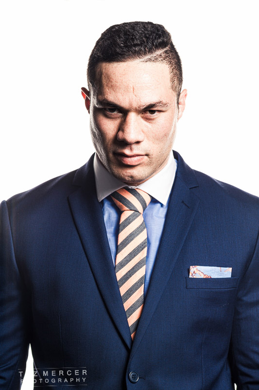
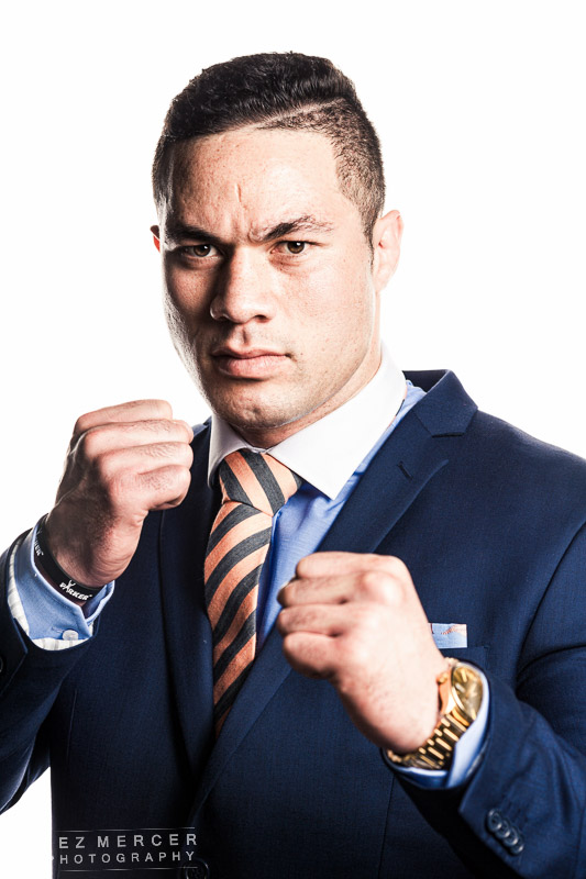
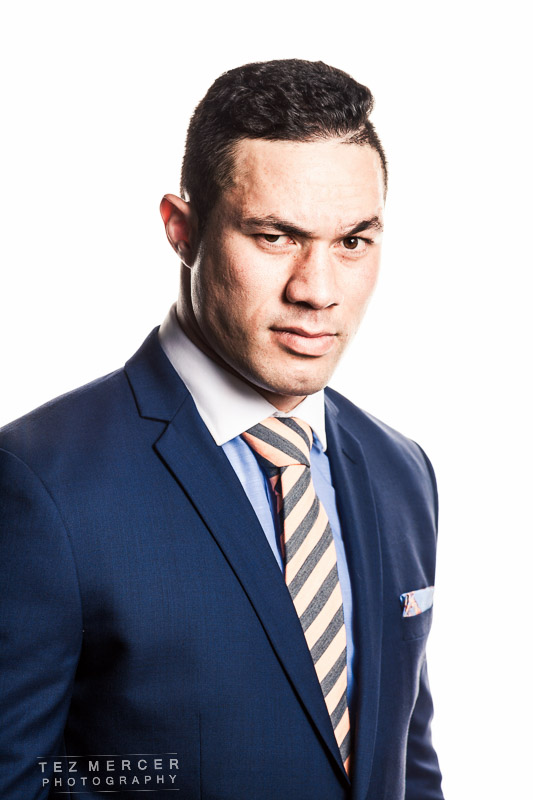
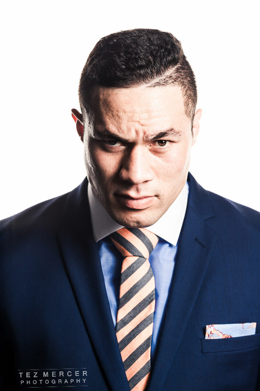
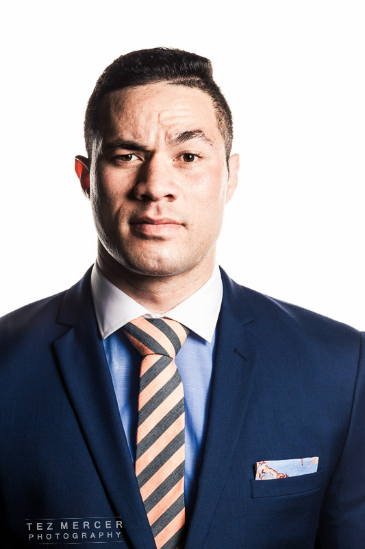
The second one down was the image selected for the cover, and the third one down was used for the hero image on the opening spread. Lighting is just a big light in the back as a background and a silver umbrella around the front. I sometimes use softboxes around the front but a silver umbrella puts out a hotter, more contrasty light. I wanted some pretty deep shadows for some drama and maybe a bit of menace in some shots and a softbox would basically make it too pretty.
Look 2 was working the bag. Shots like this are really useful to flesh out the portrayal and by the shots above you wouldn’t necessarily know the guy was a boxer on his way to the top so I wanted to get some action shots of just working the bag, nothing crazy, and no suits.

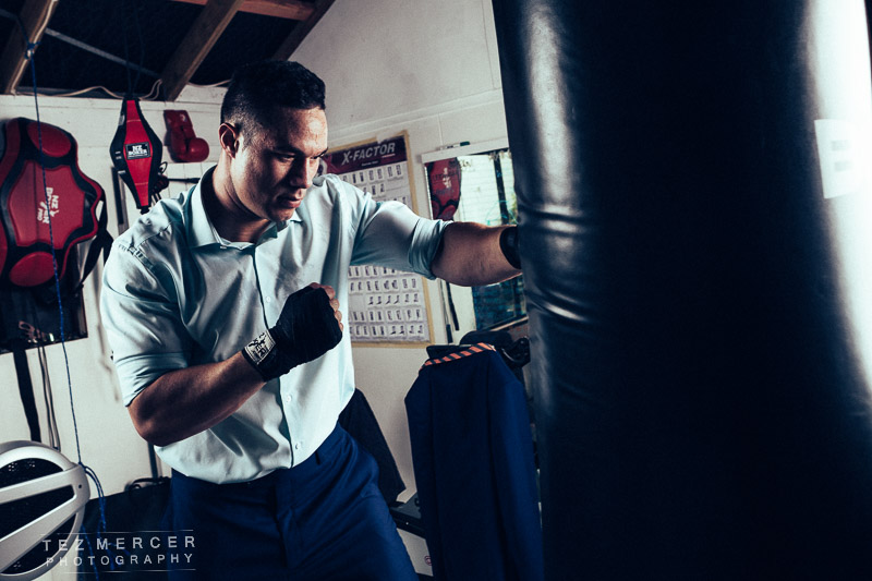
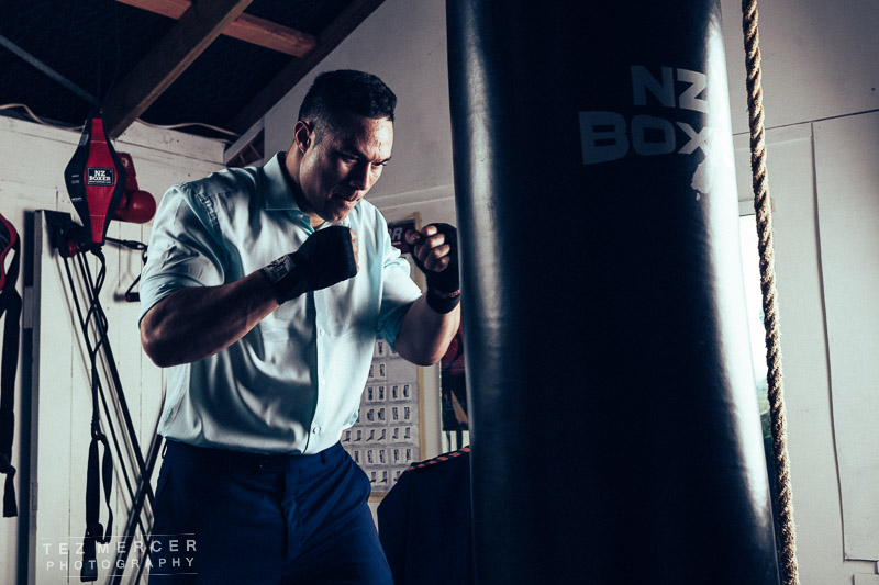
And then sometimes you turn off a light and see what happens.
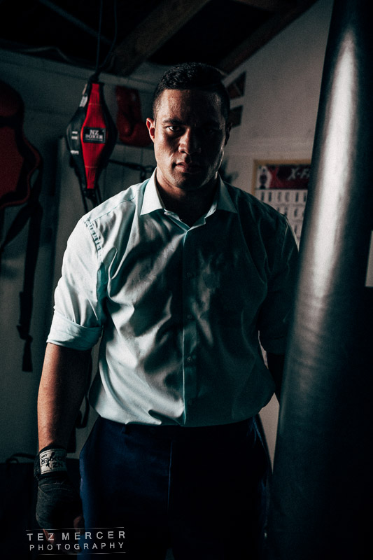
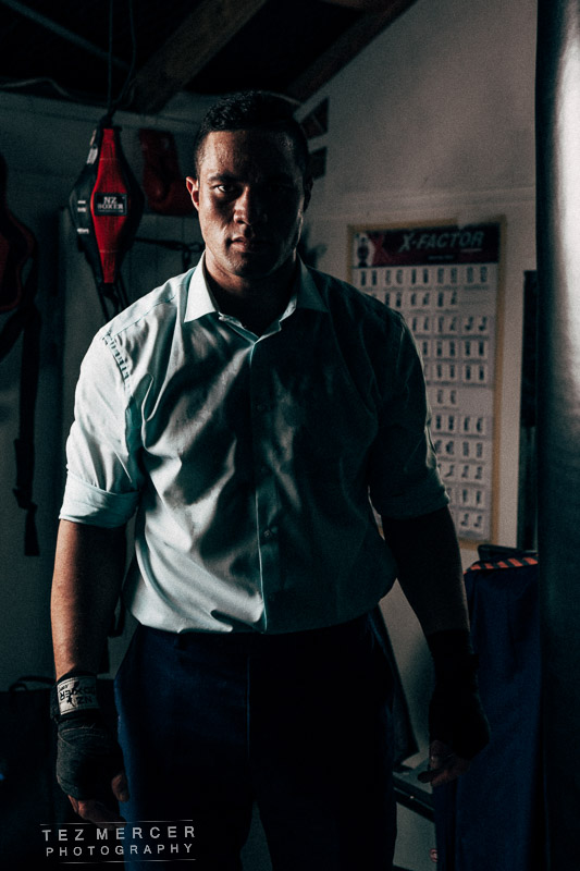
What I like about this location is that everything there is real. It’s been there for ages and serves a purpose. It became a portrait in a sense because by looking around at the things in the background you get a glimpse into the character you’re photographing. Everything is functional, used, maintained, and has a purpose to it. There’s a few personal touched like the Ali poster on the wall and some scripture quotes written on the mirror but the rest of the adornments in there are all about fighting: charts on movements, workout routines, different gloves, exercise equipment.
Onto look 3. Forgive me, it’s a tight space to work in.
Another change of outfit and time for some shots that would function as DPSs and I think would look really good with copy around them. Again, the background is as important as Joe himself and I wanted to showcase the gym as much as anything else. If you look closely, to Joe’s right is a stack of belts. You can see them in the mirror. I thought that having them openly on display, or him wearing them, would just be a little too heavy-handed and cheesily simplistic, but to his utmost credit Joe earned them and it’s only fair they be seen. This seemed like a compromise where they’re visible, but not the subject and for me, it’s the kind of thing that adds some depth to an image like the more you look, the more you see.


The light here is a bare strobe at the back (you can see it flaring in) and an octabox in the front. I wanted the light at the back to look like harsh sunlight and wanted those long shadows from Joe’s legs and feet on the floor. I shot a little upward too to make him seem looming and powerful – he’s like 6 foot 4 and in very good shape, so doesn’t need much help but still there’s a psychological element apparent when you shoot someone from below.
Do a bit of b/w closeups for added variety.


Look 4 was simplified and stripped back a little from this. I wanted to keep it natural looking, not so posey or dramatised, somewhat candid and there’s not a great deal to really say about it. I saw the ropes and asked if he could just hold one while looking at the camera. No glaring or stare downs, just look like Joe Parker when he’s Joe Parker. The first two are natural light through a side window and through a skylight in the roof. This was at something like ISO 1600 to get the exposure.


I lit a couple just to add an extra edge but I think I prefer the natural light ones.


And here’s a setup shot so you can see ‘the magic’.

And that’s about it. 8 pages, 4 looks, 1 superstar supremely humble boxer and it’s on to the next one.