It’s brand new. Spick and span. Gleaming marble, colossal windows that frame the harbour and Rangitoto in edgeless glass. There’s a vague feel of an upscale airport lounge, or a high end conference center and unlike some of these venues it’s warm, cozy, personal, and friendly. This end of the Hilton hadn’t changed in 15 years and it showed, it was never ugly and it was never cheap but it did feel a little dated and worn and a brand like Hilton needs to not only keep up with the market, but lead it.
Suffice to say it’s a nice place. I don’t want this to sound like an ad but honestly they’ve done a very very good job and I think it appeals to a more modern crowd of a more modern age than the grey suited middle agers in their starched white shirts. It’s colourful, bright, open, and that view just dominates everything and every angle… except the ones I photographed.
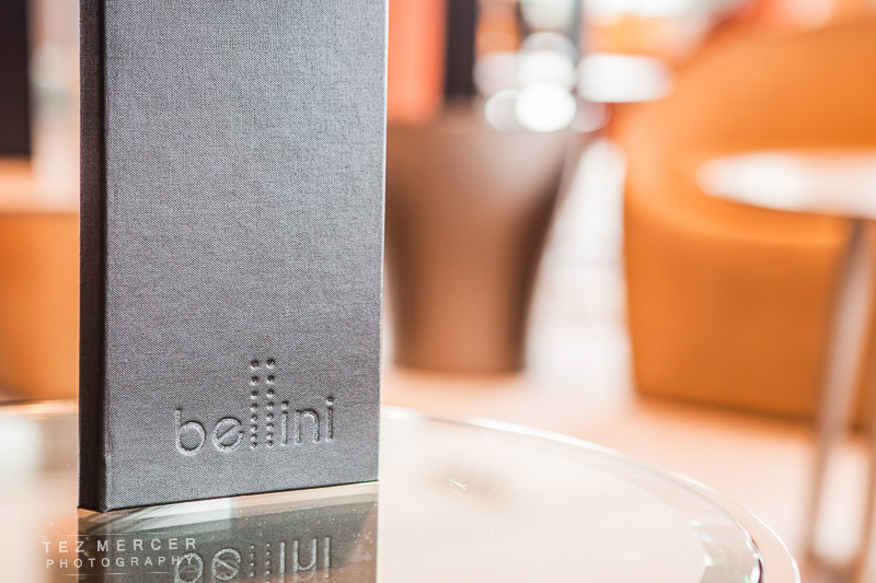

I was here on behalf of a magazine talking about the Bellini and some of the cocktails (not only their namesake) and with jobs like this you don’t really know what you’re going to be looking at when you get there and your one of the first media guys on the case. Because of that I travel general purpose, which is the 24-70mm, a fast prime (a 135mm in this case) and a 580 EX II flash, just in case and since this place had white ceilings a bounced flash would be easy to work with should I need to do such a crazy thing.

If I can, I shoot at the long end of the lens. It flatters locations and pulls the background closer to the front (what we call compression) so the room looks cozier, better furnished. If shooting wide things have a tendency to look disconnected from each other due to the exaggerated gaps between things and if I shoot wide I try and put things in the corners of the frame to hopefully look a little bit nicer.


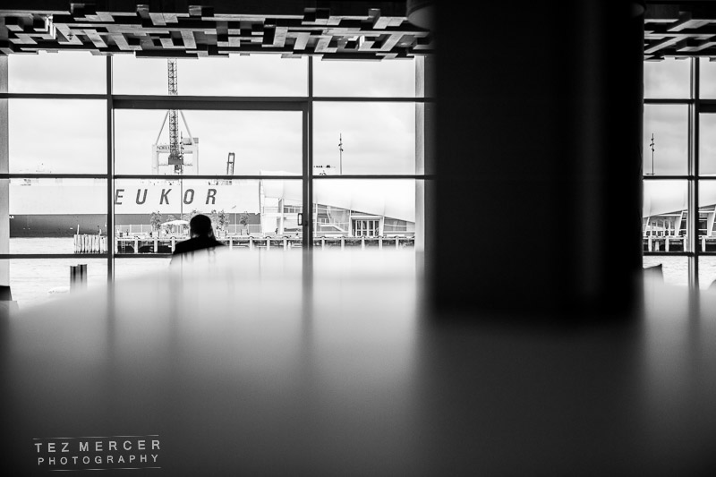
There’s an aspect of photography I should probably devote more time to: trusting your eye. I’ve mentioned before that before taking any shots I like to walk around a place and get a feel for the lines and what the architects had in mind when they designed something a certain way and to get my head in the right space to hopefully do justice to their intentions. Walking around the Bellini I loved how the pillars lead you around the space from reception, to the tables, and outside to that view where the sea awaits.


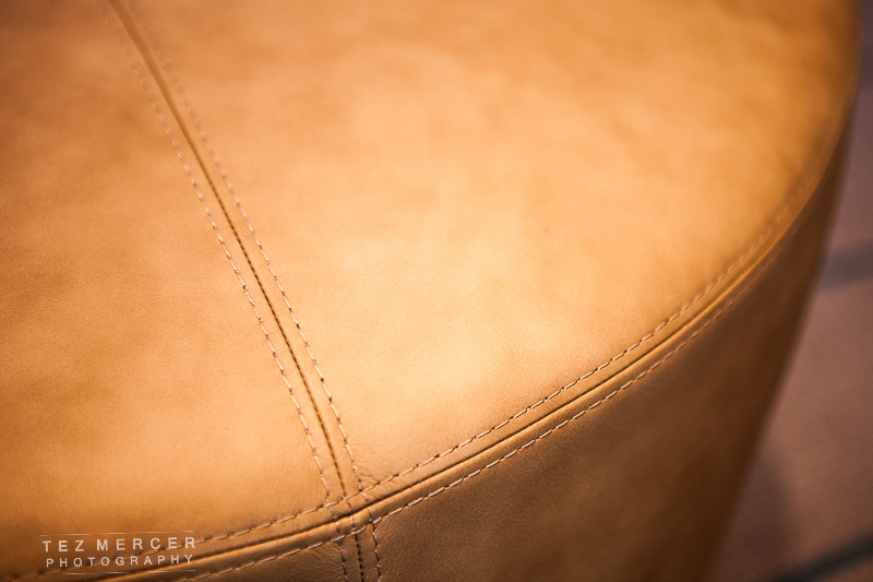
Nice orange/teal colour palette going on too and it’s nice to not see shades of grey all over the place. Speaking of which.
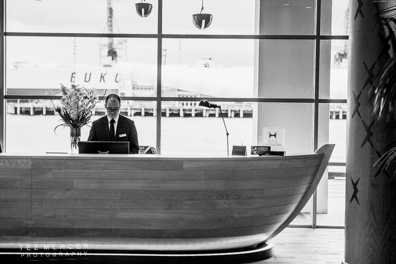
The maritime theme, and proximity to the sea is everywhere – the shape of the reception desk, the materials used, the shades of blue and green, and even the lampshades hanging from the cieling are miniature boats.
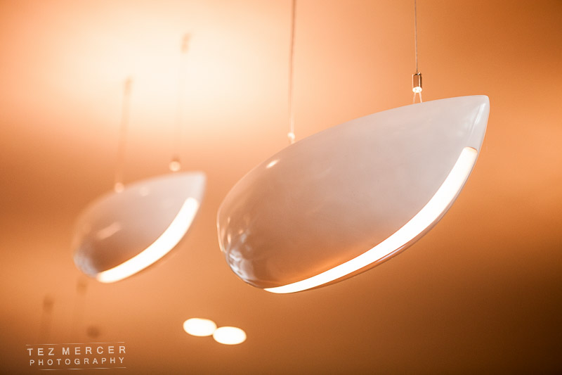
Everything here was shot at 70mm with the exception of that one wider shot from before. I kept the aperture wide open, not only for shutter speed reasons but for those hopefully artistic moments when you can pull something out of an area to draw attention to it. The out of focus areas are called ‘bokeh’ and is a Japanese term for the aesthetic quality of the out of focus parts. Every lens has different bokeh- some lenses render the bokeh beautifully well, others not so much. It can be distracting, or nervous looking, or it can be creamy and soft and rich and things just pop out of it. For me, it’s a crucial part in the lens buying decision and actually the reason why I bought the 50mm 1.4 and not the 50mm 1.8, but there we go.


And the cocktail itself! Skillfully prepared.
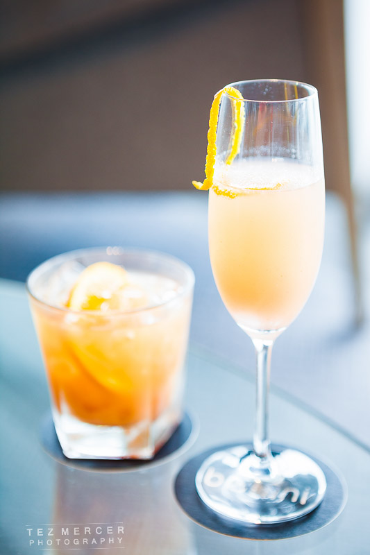
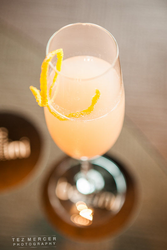
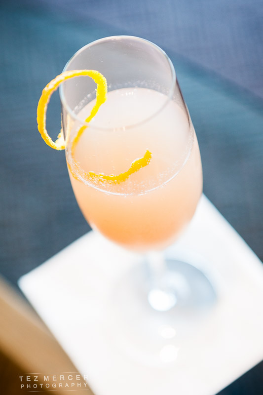
And that’s about it. I swapped the napkin for a coaster because napkins look a bit naff.